Avatar
Avatars are images that users can set as their profile picture.They can be custom photos, uploaded by users, or generated as Identicons as a placeholder.
Sample Avatar
<!-- Small avatar  -->
<img alt="profile-picture" class="avatar avatar-sm" src="../assets/avatar.svg" />
<!-- Medium avatar  -->
<img alt="profile-picture" class="avatar  avatar-md" src="../assets/avatar.svg" />
<!-- Large avatar  -->
<img alt="profile-picture" class="avatar avatar-lg" src="../assets/avatar-square-bg.svg" />
<!-- Extre large avatar  -->
<img alt="profile-picture" class="avatar avatar-xl" src="../assets/avatar-circular.svg" />
Alert
Flash messages, or alerts, inform users of successful or pending actions. Use them sparingly. Don't show more than one at a time.
Sample Alert
<!-- primary alert -->
<div class="alert-box alert-primary text-lg text-white">
Proceed to checkout
</div>

<!-- alert secondary -->
<div class="alert-box alert-secondary text-lg text-white">
Product added to <a href="#" class="alert-link">Cart</a>
</div>

<!-- side border alert -->
<div class="alert-box side-border text-lg text-white">
Proceed to checkout
</div>

<!-- success alert -->
<div class="alert-box alert-success text-lg text-white">
<span><i class="fas fa-check-circle alert-icon text-lg"></i></span>
Login Successful
</div>

<!-- danger alert -->
<div class="alert-box alert-danger text-lg text-white">
<span><i class="fas fa-exclamation-triangle alert-icon"></i></span>
Something not ideal might be happening.
</div>
Badge
Badges are used to highlight an item's status for quick recognition.
Badge on icon
<div class="badge badge-icon">
    <i class="far fa-bell fa-lg"></i>
    <div class="number badge-primary text-white">10</div>
</div>

<div class="badge badge-icon">
    <i class="fas fa-shopping-cart fa-lg"></i>
    <div class="number badge-secondary text-white">15</div>
</div>
Badge on Avatar
<div class="badge">
   <img alt="user-image" class="avatar " src="../assets/avatar-square-bg.svg" />
   <div class="online"></div>
</div>
<div class="badge">
   <img alt="user-image" class="avatar " src="../assets/avatar-square-bg.svg" />
   <div class="offline"></div>
</div>
<div class="badge">
   <img alt="user-image" class="avatar " src="../assets/avatar-circular.svg" />
   <div class="dnd"></div>
</div>
Button
Buttons are used for actions, like in forms, while textual hyperlinks are used for destinations, or moving from one page to another.
Sample Buttons
<!-- primary button  -->
<button class="btn btn-solid-primary text-lg text-white">Primary</button>
<!-- secondary btn  -->
<button class="btn btn-outlined-secondary text-lg">Outlined</button>
<!-- link btn  -->
<button class="btn link-btn text-lg text-primary">
    <a href="#">Link</a>
</button>
Buttons with icon
<!-- icon button  -->
<button class="btn btn-icon text-xl text-primary"><i class="fas fa-shopping-cart"></i></button>
<!-- floating btn  -->
<button class="btn btn-float text-lg text-white text-center"><i class="fas fa-plus"></i></button>
Card
Cards can be used in various scenario they are usually used for displaying information and product actions.
Simple Text card
The Weeknd
Abel Makkonen Tesfaye (born February 16, 1990), known professionally as the Weeknd, is a Canadian singer-songwriter and record producer. Known for his sonic versatility and dark lyricism
<div class="card-details-container">
   <h3 class="text-xl">The Weeknd</h3>
   <p class="product-details">Abel Makkonen Tesfaye (born February 16, 1990), known
      professionally as the
      Weeknd, is a Canadian singer-songwriter and
      record producer. Known for his sonic versatility and dark lyricism
   </p>
</div>
Vertical card
HRX by Hrithik Roshan
Men Charcoal Grey Slim Rs.549 Rs.899
HRX by Hrithik Roshan
Men Charcoal Grey Slim Rs.549 Rs.899
<!-- vertical card  -->
<div class="vertical-card flex-column ">
   <img src="https://rb.gy/pwrsjk" loading="lazy" alt="product-image">
   <div class="card-details-container">
      <h3 class="text-base">HRX by Hrithik Roshan</h3>
      <span class="text-xs">Men Charcoal Grey Slim </span>
      <p class="card-price-info"> Rs.549 <del class="text-xs">Rs.899 </del> </p>
   </div>
   <div class="card-footer"><button class="btn btn-solid-primary buy-button text-white">ADD TO CART</button>
   </div>
</div>
<!-- vertical card  with shadow add class = "card-shadow" to add shadows to card-->
<div class="vertical-card flex-column card-shadow">
   <img loading="lazy" src="https://rb.gy/pwrsjk" loading="lazy" alt="product image">
   <div class="card-details-container">
      <h3 class="text-base">HRX by Hrithik Roshan</h3>
      <span class="text-xs">Men Charcoal Grey Slim </span>
      <p class="card-price-info"> Rs.549 <del class="text-xs">Rs.899 </del> </p>
   </div>
   <div class="card-footer"><button class="btn btn-solid-primary buy-button text-white">ADD TO CART</button>
   </div>
</div>
Vertical card with Badge and Dismiss
HRX by Hrithik Roshan
Men Charcoal Grey Slim Rs.549 Rs.899
<!-- card with badge  -->
<div class="vertical-card flex-column card-badge">
   <span class="text-sm text-center text-white">New</span>
   <img src="https://rb.gy/pwrsjk" loading="lazy" alt="product-image">
   <div class="card-details-container">
      <h3 class="text-base">HRX by Hrithik Roshan</h3>
      <span class="text-xs">Men Charcoal Grey Slim </span>
      <p class="card-price-info"> Rs.549 <del class="text-xs">Rs.899 </del> </p>
   </div>
   <div class="card-footer"><button class="btn btn-solid-primary buy-button text-white">ADD TO CART</button>
   </div>
</div>
<!-- card with dismiss -->
<div class="vertical-card flex-column card-dismiss">
   <a href="" class="text-center"><i class="fas fa-times"></i></a>
   <img src="https://rb.gy/pwrsjk" loading="lazy" alt="product-image">
   <div class="card-details-container">
      <h3 class="text-base">HRX by Hrithik Roshan</h3>
      <span class="text-xs">Men Charcoal Grey Slim </span>
      <p class="card-price-info"> Rs.549 <del class="text-xs">Rs.899 </del> </p>
   </div>
   <div class="card-footer"><button class="btn btn-solid-primary buy-button text-white">ADD TO CART</button>
   </div>
</div>
Vertical card with text overlay and Horizontal Card
HRX by Hrithik Roshan
Men Charcoal Grey Slim Rs.549 Rs.899
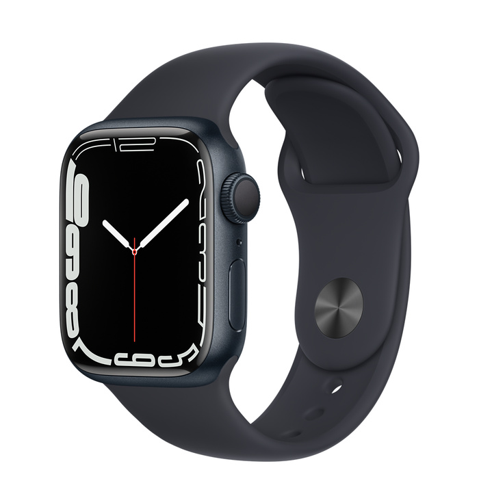
Apple Watch
Lorem ipsum dolor sit amet consectetur, adipisicing elit. Quibusdam asperiores autem iusto blanditiis consequatur dolorum sapiente ipsum molestiae.!
<!-- vetical card with text overlay -->
<div class="vertical-card flex-column card-overlay">
   <div class="overlay text-xl text-white text-center">Out of Stock</div>
   <img src="https://rb.gy/pwrsjk" loading="lazy" alt="product image">
   <div class="card-details-container">
      <h3 class="text-base">HRX by Hrithik Roshan</h3>
      <span class="text-xs">Men Charcoal Grey Slim </span>
      <p class="card-price-info"> Rs.549 <del class="text-xs">Rs.899 </del> </p>
   </div>
   <div class="card-footer"><button class="btn btn-solid-primary buy-button text-white">ADD TO CART</button>
   </div>
</div>
<!-- horizontal card  -->
<div class="horizontal-card flex-row">
   <img class="image-responsive" src="../assets/apple-watch.jpeg" loading="lazy" alt="product image">
   <div class="card-details-container ">
      <h3 class="text-base">Apple Watch</h3>
      <p class="product-details">Product details</p>
   </div>
</div>
Images
These are responsive images takes width of their container they are in.
Responsive Images

<!-- responsive image  -->
<img loading="lazy" class="image-responsive"
   src="https://images.unsplash.com/photo-1565651454302-e263192bad3a?ixlib=rb-1.2.1&ixid=MnwxMjA3fDB8MHxwaG90by1wYWdlfHx8fGVufDB8fHx8&auto=format&fit=crop&w=1780&q=80"
   alt="youtube button "  />
Round Images

<!-- round image  -->
<img loading="lazy" class="image-round"
   src="https://images.unsplash.com/photo-1431965400057-a84b80cfdbff?ixlib=rb-1.2.1&ixid=MnwxMjA3fDB8MHxwaG90by1wYWdlfHx8fGVufDB8fHx8&auto=format&fit=crop&w=580&q=80"
   alt="youtube button" />
Square Images
<!-- square image  -->
<img loading="lazy" class="image-square"
   src="https://images.unsplash.com/photo-1642726197626-f03ef77f13cf?ixlib=rb-1.2.1&ixid=MnwxMjA3fDB8MHxwaG90by1wYWdlfHx8fGVufDB8fHx8&auto=format&fit=crop&w=580&q=80"
   alt="youtube button"  />
Input
Inputs are used to receive data from the user.Element UI comes with different type of input field with authentication.
Sample Inputs
<!-- input field -->
<label for="name" class="input-label text-base">User name:</label>
<input name="name" type="text " class="input-area text-base" placeholder="User Name">
<!-- email input -->
<label for="email" class="input-label text-base">Email:</label>
<input name="email" type="email" class="input-area text-base" placeholder="Enter Email">
Input with validation and errors style
<!-- password input  -->
<div class="has-error">
   <label for="password" class="input-label text-base">Password:</label>
   <input name="password" type="password" class="input-area text-base input-error" required minlength="4"
      placeholder="Password">
   <span class=" error-msg text-xs">Something Went Wrong</span>
</div>
Typography
Element UI comes with set of text utility that can be used to override boring looking default HTML typography. By defult Element UI uses google fonts, Roboto font-family
Heading
Heading 1
Heading 2
Heading 3
Heading 4
Heading 5
Heading 6
<!-- Heading Style -->
<h1>Heading 1</h1>
<h2>Heading 2</h2>
<h3>Heading 3</h3>
<h4>Heading 4</h4>
<h5>Heading 5</h5>
<h6>Heading 6</h6>
Text size
Sample text
Sample text
Sample text
Sample text
Sample text
Sample text
Sample text
<!-- text size -->
<p class="text-xs">Sample text</p>
<p class="text-sm">Sample text</p>
<p class="text-base">Sample text</p>
<p class="text-lg">Sample text</p>
<p class="text-xl">Sample text</p>
<p class="text-xxl">Sample text</p>
<p class="text-xxxl">Sample text</p>
Font Weight
Sample Text
Sample Text
Sample Text
Sample Text
Sample Text
Sample Text
<!-- font weight -->
<p class="fw-100">Sample Text</p>
<p class="fw-300">Sample Text</p>
<p class="fw-400">Sample Text</p>
<p class="fw-500">Sample Text</p>
<p class="fw-700">Sample Text</p>
<p class="fw-900">Sample Text</p>
Text Color
White Text
Blue Text
Red Text
Black Text
<!-- text colors -->
<p class="text-white">White Text</p>
<p class="text-primary">Blue Text</p>
<p class="text-red">Red Text</p>
<p class="text-black">Black Text</p>
Text Alignment
Center Text
Left Text
Right Text
<!-- text-align -->
<p class="text-center">Center Text</p>
<p class="text-left">Left Text</p>
<p class="text-right">Right Text</p>
Lists
Element UI comes with two predefined list styling simple list and Stacked list.
Simple List
- First item
- Second item
- Third item
<!-- simple list -->
<ul class="list">
<li>First item</li>
<li>Second item</li>
<li>Third item</li>
</ul>
Stacked list
-
- Person Name
- Just followed you
-
- Person Name
- Liked your comment
-
- Person Name
- Wants to message you
<!-- stacked list  -->
<div class="stacked-ls">
    <ul class="stacked-items">
        <li class="flex-row">
            <img alt="user-profile-img" class="avatar avatar-md" src="../assets/avatar.svg" />
            <ul class="list">
                <li class="fw-500">Person Name</li>
                <li class="text-xs">Just followed you</li>
            </ul>
        </li>
        <li class="flex-row">
            <img alt="user-profile-img" class="avatar avatar-md" src="../assets/avatar-square-bg.svg" />
            <ul class="list">
                <li class="fw-500">Person Name</li>
                <li class="text-xs">Liked your comment</li>
            </ul>
        </li>
        <li class="flex-row">
            <img alt="user-profile-img" class="avatar avatar-md" src="../assets/avatar-circular.svg" />
            <ul class="list">
                <li class="fw-500">Person Name</li>
                <li class="text-xs">Wants to message you</li>
            </ul>
        </li>
    </ul>
</div>
Rating
Ratings can be used for eCommerice sites to allow the users to share theri opinion about the product.
Star Rating
<!-- Star rating -->
<div class="rating-container">
    <i class="fas fa-star enable"></i>
    <i class="fas fa-star enable"></i>
    <i class="fas fa-star enable"></i>
    <i class="fas fa-star enable"></i>
    <i class="fas fa-star enable"></i>
</div>
<div class="rating-container">
    <i class="far fa-star"></i>
    <i class="far fa-star"></i>
    <i class="far fa-star"></i>
    <i class="far fa-star"></i>
    <i class="far fa-star"></i>
</div>
Card Rating
<!-- card rating  -->
<span class="card-rating">
    <i class="fas fa-star enable"></i>
    <span>4.4</span>
</span>
Snackbar
Snackbars are used to provide brief notifications to the user.
Stacked Snackbar
This item already has the label " travel". You can add a new label.
Slider
Slider are inputs that can be used to get some value from the user.
Simple Slider
<div class="slider-container">
  <input type="range" min="0" max="1000" step="100" />
</div>
Slider with label
<div class="slider-container">
   <input type="range" min="0" max="1000" step="100" list="range-label" />
   <datalist id="range-label">
      <option value="0">0%</option>
      <option value="100"></option>
      <option value="200"></option>
      <option value="300"></option>
      <option value="400"></option>
      <option value="500">50%</option>
      <option value="600"></option>
      <option value="700"></option>
      <option value="800"></option>
      <option value="900"></option>
      <option value="1000">100%</option>
   </datalist>
</div>
Grid
Grid can be used from very basic layouts to complex ones.
Two Coloum Grid
<div class="grid grid-col-two">
   <div class="grid-item text-center text-xl">Item</div>
   <div class="grid-item text-center text-xl">Item</div>
</div>
Three Coloum Grid
<div class="grid grid-col-three">
   <div class="grid-item  text-center text-xl">Item</div>
   <div class="grid-item  text-center text-xl">Item</div>
   <div class="grid-item  text-center text-xl">Item</div>
</div>
Modal
Modals are used to attract user attention to take some action.They positioned over everything else in the document and remove scroll from the page.
Simple Modal
Demo Modal
Lorem ipsum dolor, sit amet consectetur adipisicing elit. Quisquam eos quos facilis repellendus quia sed, dignissimos nostrum adipisci reiciendis magni?
<div class="modal">
   <div class="modal-head flex-row justify-spacebw">
      <h5 class="text-xl fw-500 ">Demo Modal</h5>
      <button><i class="fa-regular fa-circle-xmark modal-cancel text-base"></i></button>
   </div>
   <div class="modal-body">
      <p class="text-base">Lorem ipsum dolor, sit amet consectetur adipisicing elit. Quisquam eos quos facilis
         repellendus quia sed,
         dignissimos nostrum adipisci reiciendis magni?
      </p>
   </div>
   <div class="modal-footer flex-row">
      <div class="flex-row modal-btn-container">
         <button class="btn btn-solid-primary text-white text-base modal-btn">Accept</button>
         <button class="btn btn-outlined-secondary modal-btn text-base">Decline</button>
      </div>
   </div>
</div>